Marketing and sales teams fight every day to win the website visitors’ attention. They work day and night to deliver a long-lasting product. Yet, there is one crucial page on your website when designing it; it’s your pricing page. If you have a well-designed pricing page, your sales will increase your sales. When creating an effective pricing page, you need to think of a place where potential customers will stay and focus on buying.
An effective website is essential when willing to get more sales and increase the conversation. It’s undoubtedly the most crucial page on your website. If your pricing page isn’t user-friendly, you won’t have enough customers. If you want your current customers and potential clients to make a payment before leaving the website, then the pricing page is crucial.
Now, let’s take a look at various tips for designing a great pricing page:
Design User-Friendly, Easy to Understand and Simple Page
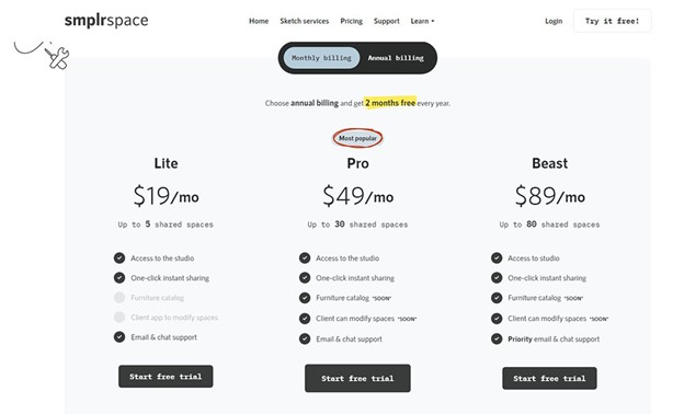
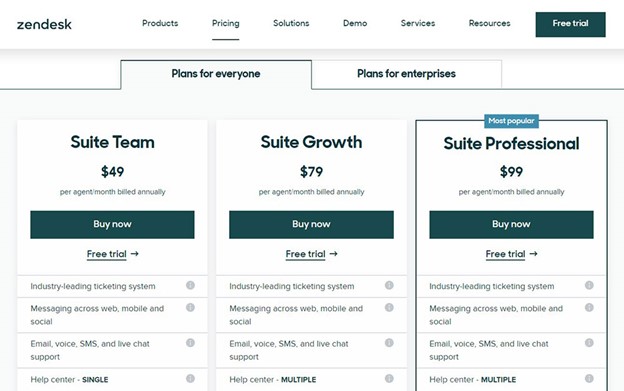
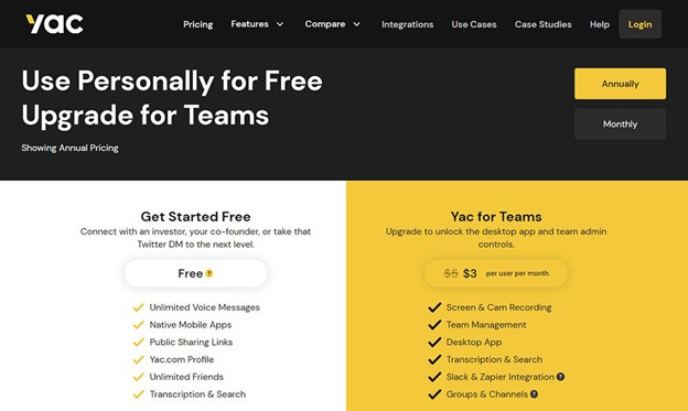
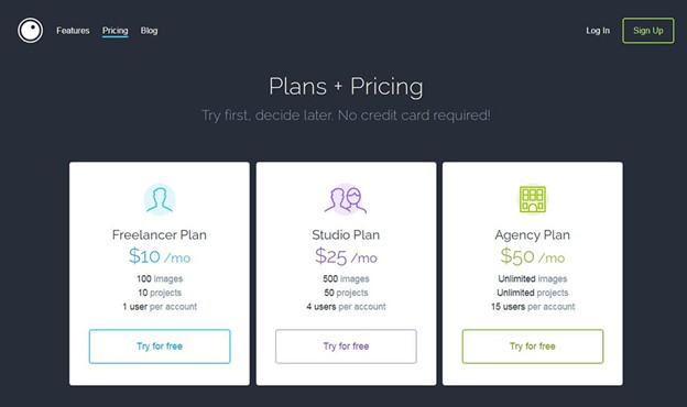
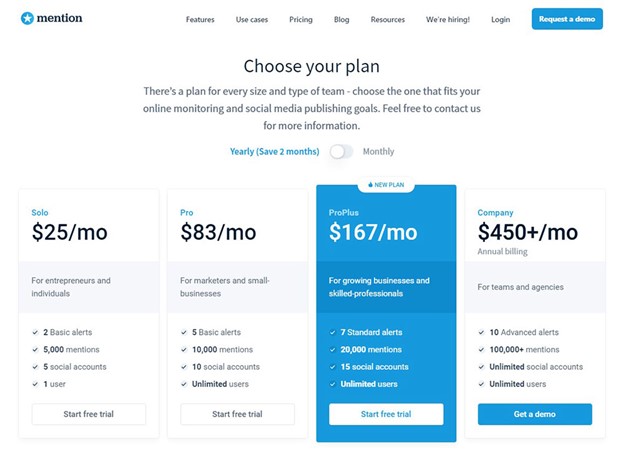
Simplicity plays the primary role when designing a page. Simple pricing pages with a basic comparison table are better than complicated ones. Yet, building it isn’t that simple. Remove all unnecessary things to make your website pricing page unique and precise. We recommend that a pricing page for your website should be simple, straightforward, and easy to read. If you put too many pricing options, the website can be confusing and overwhelming.
Did you know that user experience is crucial on any website that offers products? Well, a pricing page shouldn’t be a place for frustration. If you keep the design clear and simple, you will get potential customers’ attention. Make a section with pricing, what services are included, and differences between the offers.
Include testimonials on your website to build trust
Did you know that testimonials are a powerful tool in making your customers trust? Well, including testimonials from famous companies or individuals can result in great trust in your current and potential customers.
The most common thing that pricing pages have is- building customers’ trust. Here are some tricks that you might want to follow:
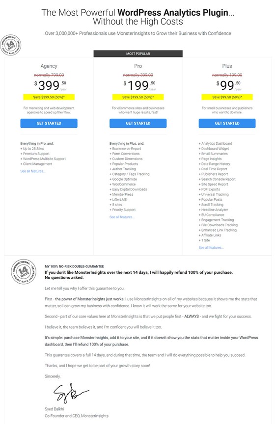
- Provide an option of Money- Back guarantee
- Protect and Secured Data
- Section with Customers’ Reviews
Create CTA or Call to Action Button at the Top
Those who have websites already know that the CTA button is crucial in website marketing and getting a success rate at the end of the sales pipeline. The call to action button is essential in any action of marketing. Don’t forget to add this button when designing a website. If you include this button on your site, people will buy in a second when landing on it. Put the CTA at the top of your website so your visitors can see it easily and take action.
Highlight Free Trials
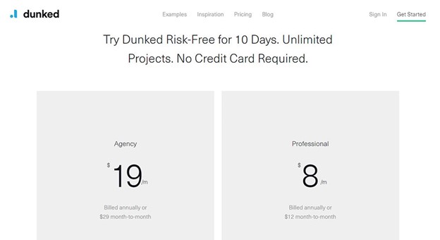
Free trials are a crucial factor in getting new customers. A recent study found that free trials impacted 62% of companies get at least 10% of their business and 16% of companies get more than half. No doubt- free trials in marketing increase sales.
Provide Customers Which One Offer Is Better
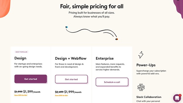
There is certainly a package on your website you want your visitors to buy. Design the offer differently and why it is best-selling. If you give your visitors why this package is better than the others, they will surely buy it. We provide you with some tips on how to highlight the option you want your visitors to select and buy:
- Add different icons, effects, and discount label
- Add different colors to the offer. You could try a green shade.
- Put an additional call to action button
Promote Value Instead of Cost
Provide the value of your products, and you will get customers’ attention. Plus, customers care about a product’s value and won’t care about the price.
Use Small Currency Sign and Round Numbers
Did you know that the round numbers are more willing to remember? Recent research has shown that many people prefer round numbers such as 10, 50, and 100. Plus, if you include, for example, a prominent dollar symbol. It will have an impact on visitors’ psychology and make them spend money.
Test your Pricing Page
Marketing strategy includes testing. It is an essential component of any good marketing. If you make some mistake in pricing, you will lose customers. Ensure that pricing and review metrics to your page include pricing, copy, conversation rates, page layout, headline, call to action, bounce rate, etc. If there aren’t any results, make some changes.
What does a great pricing page look like?
Here are various design examples of pricing page that will inspire you to create an effective one:
TunnelBear
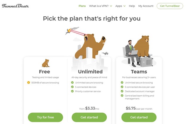
TunnelBear is a great example that has a simple pricing page. It provides a VPN solution for users to browse the web securely and privately. This website uses splendid illustrations of bears that have various pricing plans. These illustrations present the brand straightforwardly and uniquely.
Spotify
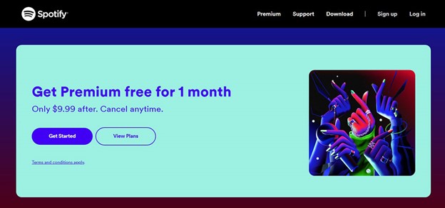
Spotify is quite a famous web-based digital music player. It gives users access to millions of songs. Plus, it offers a premium free trial of three months. The platform provides the reasons why you should pay for a premium plan. Whether you want the premium plan or not, you can try it free so later decide. You have nothing to lose if you give it a try.
Adobe
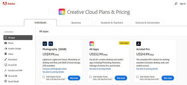
Adobe provides users with designing tools for apps and a host of the web. It offers various tracks for your professional needs. Its pricing page’s design includes product cards and a navigation bar to choose tools easily.
Ticketleap
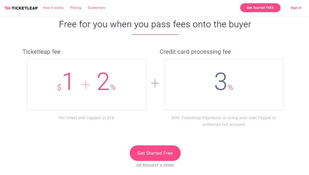
The Ticketleap platform offers event marketing and online ticketing. When you enter the platform, you will see an effective, intuitive, and informative pricing page. It provides an easy and simple fee calculating process. There is a phrase on the platform “Fees suck, so we’ve made them as low as possible.” It makes users feel like Ticketleap is the most flexible and valuable platform.
Hubspot
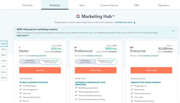
Hubspot is a software platform that offers customer service, sales, marketing, and many other services for those who don’t know. They offer various plans, so it’s hard to work out a budget for their Customer relationship management services. The platform provides a double tab navigation bar, making it easy for users to calculate fees. There is also a price calculator, and that is a smart move for a platform that offers many alternatives.
In marketing, a pricing page is the most crucial page. Different companies have a target audience and according to users’ needs. It is essential to create a suitable pricing page. Despite the cost of your products, your pricing page needs to be optimized. It is important to focus on organizing your information. Pricing pages are essential for online business. You need to use them wisely and optimize them correctly. Create engaging content, and that will sell the values and benefits of your product.
Source link

