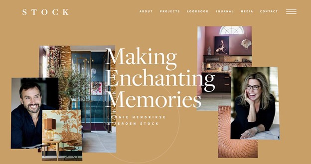
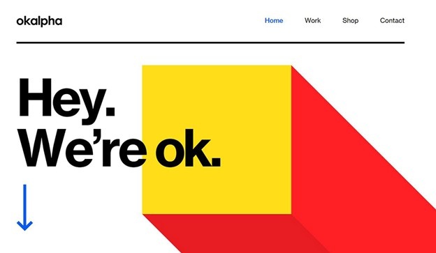
Parallax scrolling is a trend for websites where the background content is moved while scrolling differently than the foreground content. This trend has become quite popular in the last few years, and that’s explainable.
It is used when a website’s layout perceives the site’s background moving slower to the foreground while making a 3D effect when a user scrolls. If used carefully, it can offer a pleasant and subtle effect that can result in a memorable and unique website.
As we already mentioned, the parallax is present for years around us, precisely in video games. Yet, it became popular in the world of web designing. This remarkable is quite often seen as part of a web page scrolling feature. Parallax scrolling uses various backgrounds that look like they move at distinct speeds and create a depth sensation. It establishes a 3D effect imitation and quite a fantastic browsing experience.
Now, let’s check out some websites and techniques that provide us with the new style and where we can use it:
Background Parallax Sliding
When a user scrolls down different content as full-page areas, parallax background effects are created. Often these effects include animations but also have some series of backgrounds that are fixed and move as you scroll down. It is an action of a displacement of every background image.
Parallax Scrolling Horizontally
There’s an alternative to applying horizontal content scrolling. Yet, many users ask, is this a parallax? Well, everything depends on how they create the effect, so the answer is no and yes. Horizontal motion is one more technique to generate the impact of displacement.
Graphics Animation
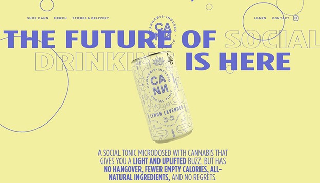
Website graphics that are animated are a mix of reality and imagination, and in combination with the effect of scrolling, users can get some unusual parallax features. The most usual effect is the as-you-scroll animate page graphic. It is a mix of JavaScript and images via CSS. This effect is an excellent design for pages, and it can bring a support message to anyone by providing original design techniques.
Featured listing
Feature listing is the place where the designer can forecast and present what the products can. Texts and big icons that are animated are a necessity to enliven the products and services. Design of parallax scrolling where features appear from various sides of the screen makes the impact more acute.
The Footer Section
Parallax can make a footer section look incredibly fascinating and exciting. When the footer section enters the screen while scrolling down, it increases inside the search bar. It makes a dynamic impact as a call for action on visitors.
Gallery pages
A beautiful gallery scroll animation is pretty captivating and engaging to grab the views attention. Gallery page images moving in opposite directions are lovely. Visual effects like these make the site looks splendid.
Website Style
The repeated pattern method allows scrolling to display the individual tiles built. Using one huge image compound of various images is a great choice. This Sprite Method is very popular on the menu of navigation.
Storytelling
Parallax scrolling provides with telling a story in a very interactive and engaging way to visitors. Just let them go along with the story at their own pace and take control of it. Various layers create a depth sensation that responds distinctively to the scrolling. Plus, they permit numerous storylines.
Product Presentation
The practice is a brilliant way to present products. For example, with a standard web technique aside from flash or video, designers could only show static web content. The dew technical development allows users to visit the website and explore the designers’ products independently.
3D Product
A 3D technique allows the designer has a 3D presentation while scrolling instead of static images. The design is simple, including many whitespaces and drawing too much attention. The website reflects the Product’s perfection ideally.
The Long Scrolling Parallax Effect
Clean interface and sleek animation, while contrasting nude and dark colors, make the design unique. When adding parallax to the bag makes a complete and memorable experience in online shopping.
Changing colors on scroll
This awesome website changes background colors as you scroll, going from what appears to be a red and yellow color palette to pink-blue, blue-beige, black-yellow, and pink-blue again.
Parallax slider effects
This method offers different strategies to use the effect of parallax on the website. The most usual form to use is the background parallax. There’s a picture that creates the depth illusion in the background. Smart slider provides more opportunities than the “usual” parallax. Every designer can use the layer’s effect where the visitor can activate them by moving or scrolling the mouse.
Slide switching parallax
The slider of scroll parallax cannot work when the page has a slider, but it looks pretty great. Fortunately, the slide switching parallax needs just two images in the slider. Then, designers can enable the parallax switching animation at the Main animation. Furthermore, the Main animation is a simple way to change slides, and the effect of parallax is an excellent addition.
Some other examples
There are great examples of the website’s same landing page that show what parallax scrolling adds to the user experience. Here are some of them:
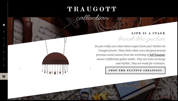
Clean interface, sleek animation while contrasting nude and dark colors make Fluttuo different from the crowd of e-commerce. If you add a parallax effect to the bag, it will make a unique and complete online shopping experience.
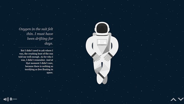
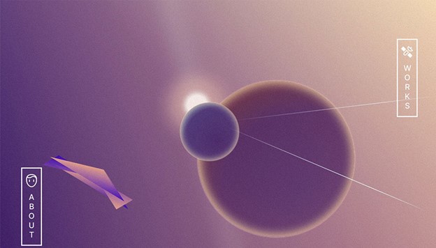
It is an interactive experience describing the story of planetary prospectors. NASA Prospect has sent them out to rediscover what humankind has left scattered across the solar system. It is a delightful, simple, and interactive parallax effect use. The audio immensely helps to set the scene, and it is a captivating design insertion.
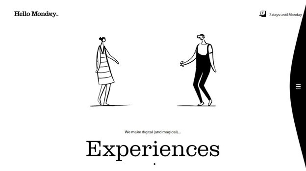
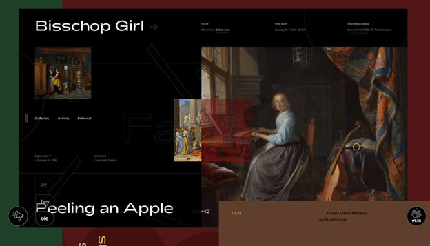
Hello Monday displays a 3D parallax effect on split-screen. It features design cases that are down on one screen side with case details and descriptions on the other side. Every design case has a unique feel and look.
Conclusion
The web user of today wants to get entertained and involved. We are more than willing to engage with a website if we are invited to do so anyway. With parallax scrolling, users can do many great things to invite visitors to engage with the designer’s website. Nearby objects have a larger parallax than more distant objects when observed from different positions so that parallax scrolling can determine distance.
Source link

