Color has an underappreciated impact on how we see the world around us. Colors, on the other hand, have a lot of power. Brand colors are an important component of every company’s image. Once selected, they form a part of a company’s identity and assist to define how the public perceives it. Every designer’s job is to take a product or project and make it user-friendly while adhering to commercial objectives.
Some of us simply lack the ability to combine colors to create visually appealing designs. As a graphic designer, or any designer for that matter, you must understand the many mixtures and connections that colors have with each other in order to ensure that you are putting them together in such a way that just looks really good.
This is not a simple process. Designers are in charge of everything from interface design and user interactions to fonts and color schemes.
It’s essential to understand why your website’s color pallet is so crucial. It makes no difference whether you’re creating a complete website or a single throwaway print ad. Designers frequently have to experiment with color palettes for a long time before they believe they have it perfect. Colors may elicit emotional reactions depending on the palette used.
Each small aspect in your website design is significant and has an influence on the customer experiences in some manner. It may influence anything from how long they stay on your website to whether or not they click the “purchase” button.
You could also create the ambiance for your website by selecting a color theme that represents the emotions you want your viewers to have. They will be considerably more inclined to stay if your website is cohesive and visually attractive.
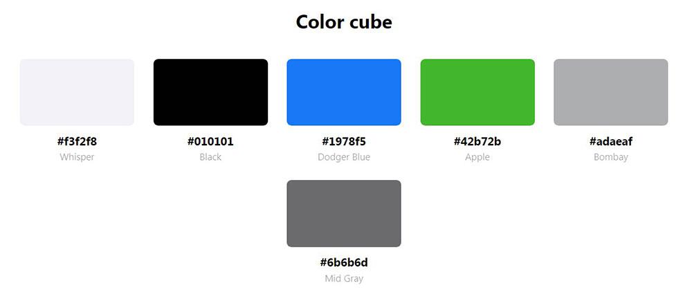
Types of color palettes
If you would like your project’s spectators to feel at ease, you should first learn about the interactions that colors have with each other.
Monochromatic color palette
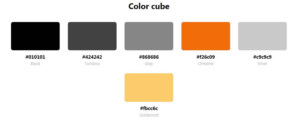
It is made up of several hues, tones, and tints of the same color, all around a contrasting orange color palette. Because they are all based on the same hue, they might be the easiest color schemes to develop. There are practically no danger zones in going this path for your design. However, if done incorrectly, monochromatic colors may be dull. Take a look at architecture portfolios, for example. The colors they choose are intentionally dull so that the images stand out easier.
Analogous color palette
Analogous color schemes are color pairings comprised of hues that are neighboring to each other on the color spectrum. These palettes are generally excellent at showing consistency and uniformity within design. It is advisable not to distribute these colors out evenly in design. Alternatively, pick one hue to stand out and the other to complement it. They’re especially simple to deal with since there isn’t a lot of variation in color.
Complementary color palette
Occasionally, opposites astound us and truly appeal. Complementary palettes are excellent for conveying a sense of harmony. It conveys strongly, so if that’s the mood you’re aiming for, employ this color palette to your benefit.
This type of color palette is something that you usually see in spa websites or in spa WordPress themes as an overall palette for the site. But also for landing pages, or pricing tables, so that they would make the CTA stand out.
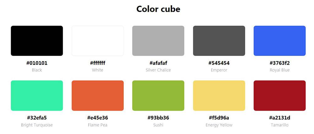
Triadic color palette
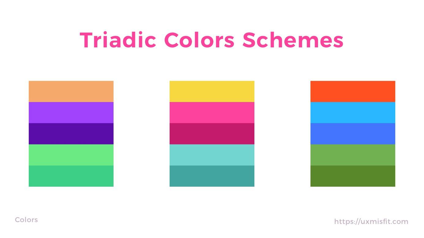
Triadic color palettes are made up of three hues that are perfectly aligned on the color spectrum. The triadic approach results in a more varied palette. This requires a bit more thought and experimenting since it involves a greater number of opposing colors. Triadic color palettes, on the other hand, accomplish this impact without disrupting the serenity.
You may utilize a variety of website color palette selections, but keep your industry and the colors associated with it in mind at all times. The color palettes of the best brands’ websites are skillfully picked and flawlessly match their brand image and story.
Examples
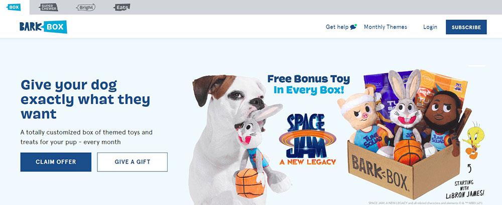
BarkBox is a wonderful example of a website that uses a charming website color palette to make viewers feel comfortable and welcome. Applying complimentary colors to direct users’ eye where you want, it may assist boost the color palette of any website. The calming pink hues are continued across the page, and they combine very well with blue shades used with both the website design and the brand’s symbol.
- Blue represents trust, tranquility, confidence, and intellect.
- Pink is associated with beauty and tranquility.
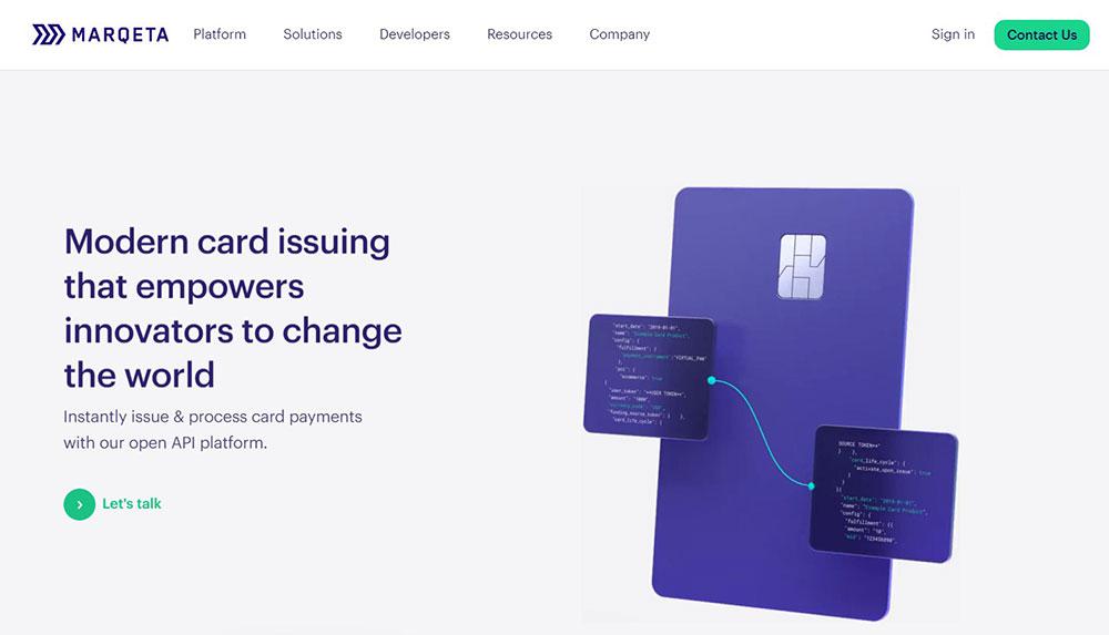
A fintech firm that intends to challenge the financial card business. Marqeta addresses the color palette from both an emotive and a technical standpoint. Because Marqeta takes a less traditional approach to consumer lending, their usage of blue deviates from normal corporate branding. Its website color palette consists of dark blue, cyan, and purple.
Because the three hues have commonalities, using analogous colors allows for some color variation while maintaining a sense of harmony.
- Blue represents trust, tranquillity, confidence, and intellect.
- Purple represents wealth, ambition, and innovation.
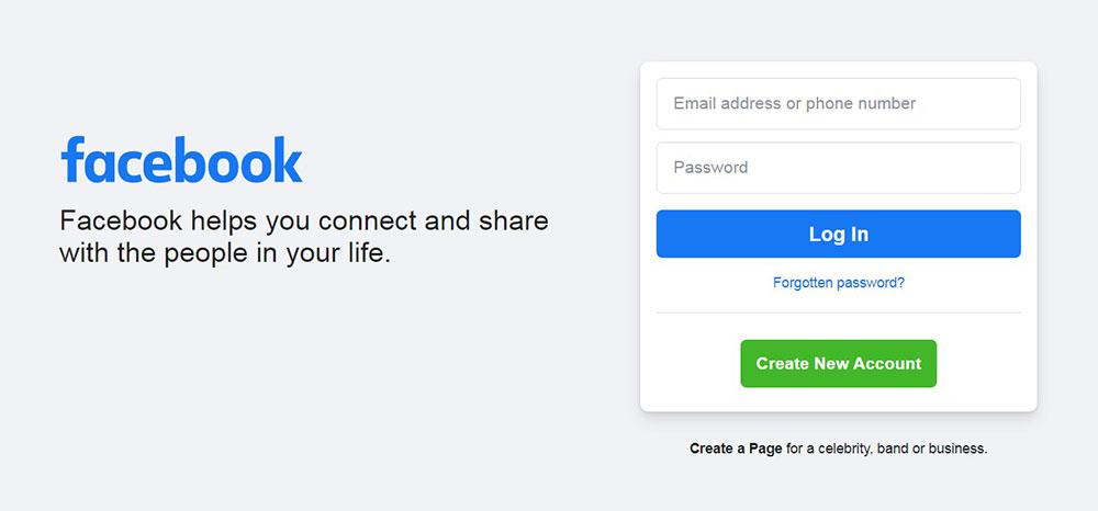
Whenever you think of the social media website Facebook, single hue immediately comes to mind: blue. Facebook initially chosen blue because its creator, Mark Zuckerberg, is colorblind in the red-green spectrum.
Although this may not appear to be a particularly rational reason, the color choice has had a big impact on our image of this successful startup. White is the backdrop color of the Facebook app, as well as a secondary color utilized by the brand. Plenty of us see the color blue as comforting, friendly, and peaceful, a place where we may escape from the stresses of the outside world.
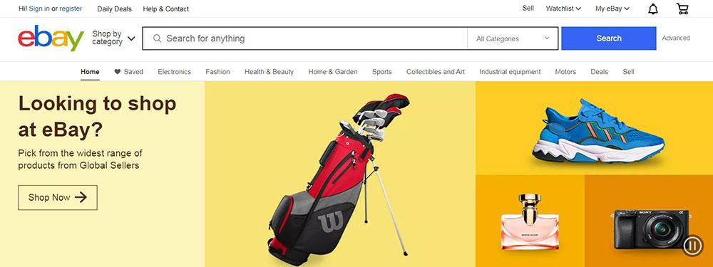
eBay has a diverse color palette. eBay’s color scheme of red, blue, yellow, and green is meant to represent the diversity of its international market. Green is frequently used on their website. The eCommerce business employs the symbology of this hue to represent financial riches, or in this case, cost savings, and to entice viewers to make purchases.
- Red represents energy, strength, and passion.
- Blue represents trust, tranquillity, confidence, and intellect.
- Green stands for ambition, development, freshness, and safety.
- Yellow represents pleasure, intelligence, vitality, and brightness.

LemonStand is a website that might profit from utilizing a blue-yellow website color palette. The blues and grays complement the yellow and serve to soften its radiance. They did, though, masterfully blend this vivid hue into the palette without making it too overpowering and disruptive.
- Blue represents trust, tranquillity, confidence, and intellect.
- Yellow represents pleasure, intelligence, vitality, and brightness.
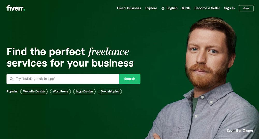
You may have noticed that many businesses reserve a certain hue, in the instance of Fiverr, green, for CTAs and do not use it anywhere else on the website.
- Green stands for ambition, development, freshness, and safety.
Conclusion
Colors and their many hues play an essential role in website designing. Your website’s color scheme must not only represent your brand, but it should also speak to your target demographic. People may be turned off by your website without even recognizing it. Your color palette will be a crucial component of your brand kit, which is effectively your graphic design bible.
This is a resource that you generate while developing your visual brand identity. It comprises your typefaces, picture styles, and logo. So, while selecting color palettes bear in mind the business you operate in as well as the target demographic. Experiment with the color tools to determine which of the website color combinations best suits your concept.
When selecting a website color scheme, keep emotional response, technical compatibility, and functionality in mind. Using a suitable color scheme, whether strong and brilliant or subdued and relaxing, is the greatest approach to guarantee that impression is a favorable one. Taking inspiration from the businesses mentioned above cangive you some ideas for what colors you might use for your own brand or website.
About the Author

Bogdan Sandu
Bogdan is a designer and editor at DesignYourWay. He’s reading design books the same way a hamster eats carrots, and talks all the time about trends, best practices and design principles.
Source link