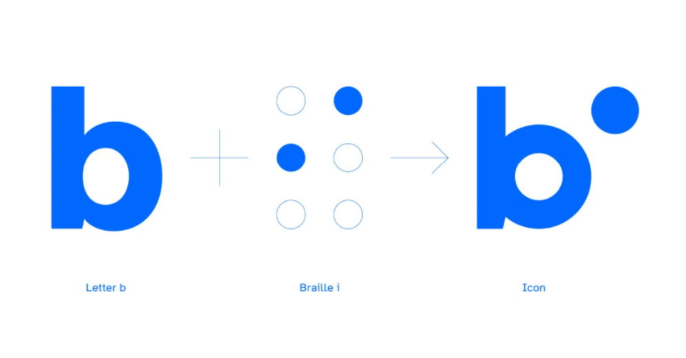
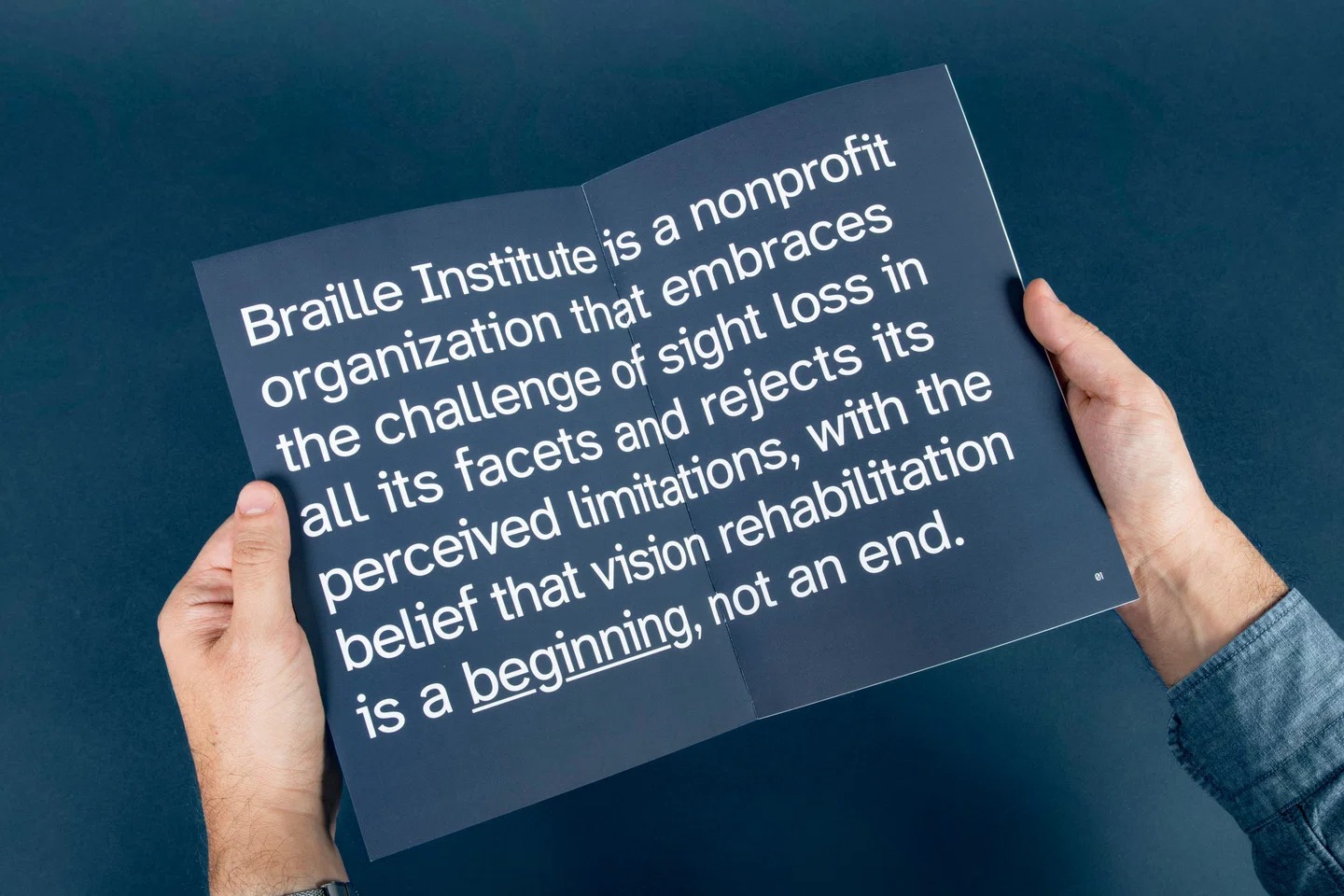
Over a million adults in the USA are affected by blindness, and a much larger number suffers from various forms of visual impairments. The Braille Institute, which has a century-long history of helping people with visual issues, decided to take its experience to address the problems its members face when reading and writing on digital devices.
For that, they partnered with Applied Design, a New York-based design agency, to create a typeface for the visually impaired. The font was named Atkinson Hyperlegible, after the Braille Institute founder Robert J. Atkinson.
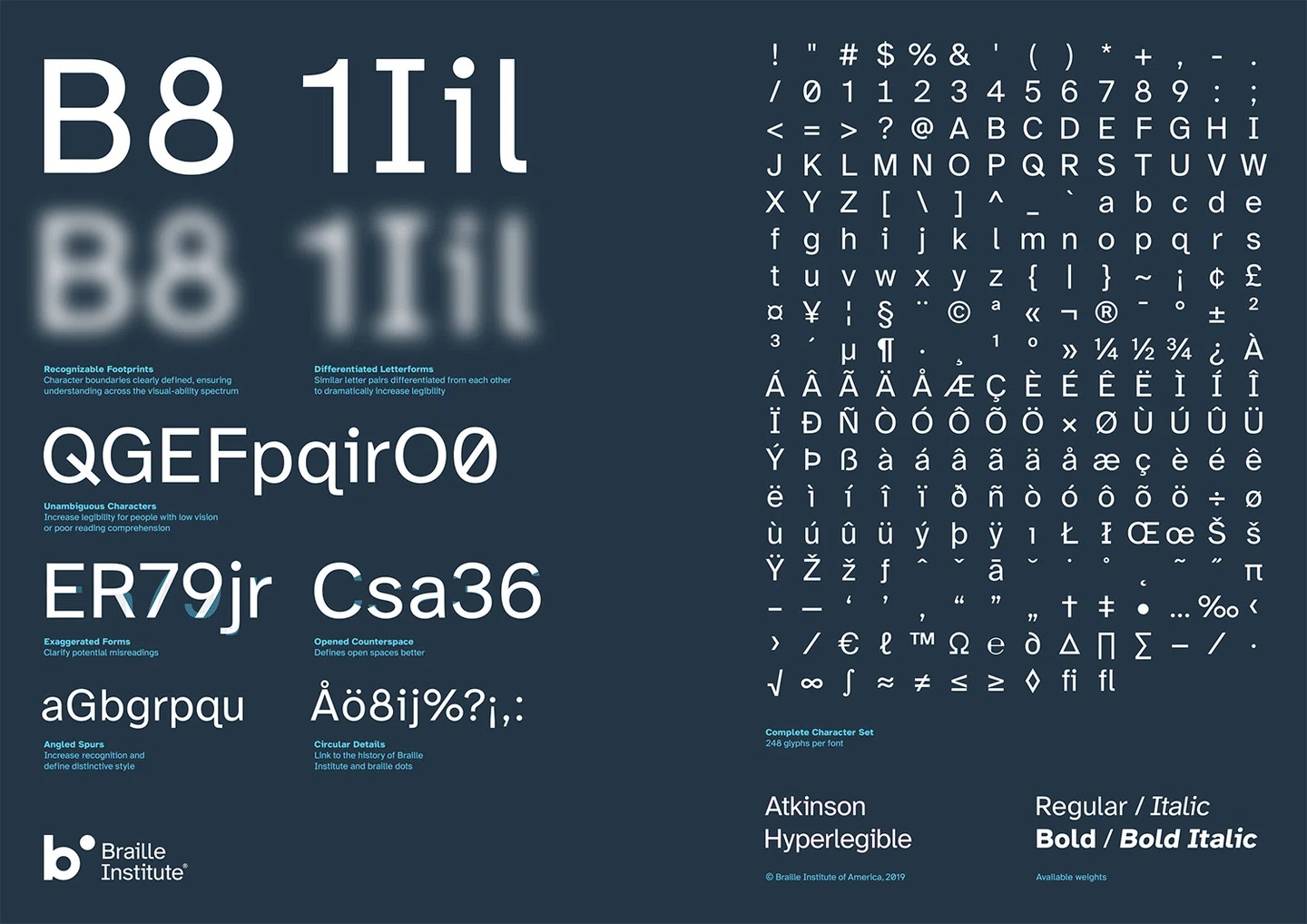
Atkinson Hyperlegible was designed to focus on letterform distinction instead of aiming for uniformity of shapes. It comes in 4 weights and supports the accented characters of over 25 languages and mathematical symbols. It has already won an award of Fast Company’s Innovation by Design Awards in the graphic design category. You can download it for free on Google Fonts.
About the Author

Mirko Humbert
Mirko Humbert is the editor-in-chief and main author of Designer Daily and Typography Daily. He is also a graphic designer and the founder of WP Expert.
Source link